Monday, October 25, 2010

Romance


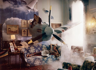
This photograph by Tim Walker is one of my favorite images. It is so romantic, peaceful, naturally beautiful and unique; the brief I am completing at the moment has taken a lot of inspiration from this picture as I want the brand to ooze all of these qualities. This photograph will always be up on my wall and I can't see myself ever getting bored of it...maybe I'm just a romantic but every girl has that part of her hidden away somewhere, what photograph brings it out of you??

MOLTO. 7days in 1 minute

I travelled in Greece for two months last summer and discovered their obsession with Molto Croissants! This advert appeared everywhere and I remember thinking how much a loved it every time I saw it; the concept is 7 days in 1 minute, a series of film clips and still captions which tell this boy's story at the speed of light! What fascinated me the most was that the concept, imagery, settings and medias all morph and link together so well that even though there is a language barrier and we cannot hear the narration, you can still understand and piece together what happened in his 7 days and really enjoy watching it. The advert projects this sexy, carefree, gorgeous lifestyle which means you are a bit surprised when you realise it is promoting pre-wrapped croissants. 


Wednesday, October 13, 2010

Jonathan Ive - Apple's intelligent designer


 On a similar topic to the previous post, science has never really been one of my passions and if I'm honest, I don't tend to appreciate or take into account the genius and masterminding that is behind all the 'gadgets' or 'mod-cons' we use today. 
Jonathan Ive is the technical genius behind all of those "products we clutch in our hands and stuff in our ears" and it is his obsessive approach to "the craft of design" that has made me want to draw your attention to this small article about him as he has been ranked at No5 in the top 100 scientists worldwide. 
As I have said before, I struggle to become excited about the discovery of a new planet, formula or cells, but in this case, we all know what a huge step forward in design, science and engineering the Apple range has become, and just to hear a few words from the senior vice-president who eats, sleeps and breathes design, I thought was something worth sharing; he has created a new breed of electrical device, none of his creations have screws, fans or joints and have completely changed the way we live.

"When something exeeds your ability to understand how it works, it sort of becomes magical."
Jonathan Ive talking about the iPad


The Times - Eureka magazine


With The Times last weekend came 'Eureka', a magazine that has put together "one of the first ranking of people in science", says the editor, James Harding. Accompanying this science list was 'Prime Numbers', a two page spread of interesting facts and data, recorded on an average per person, per year. I wanted to upload this on my blog because I am someone who has always failed to be inspired and kept on the edge of my seat when it came to talking about science, but this spread is a perfect example of how to get someone like me, interacting with the subject. I also really liked the graphics and the layout, it was very inviting and easy to read, didn't look typically 'sciencey' or perhaps boring, it was just simple and direct and there wasn't one fact that didn't interest me.  

My favorites, on average per person for the year are:

220 plastic bags per adult used, only 1 recycled. 
Dreams - 1,460
Nightmares - 1.5
Laughs - 5,475
Words spoken by a man - 2,600,000
Words spoken by a woman - 7,300,000
Average hangovers at work - 36
Calories consumed - 803,000


Monday, October 11, 2010

Banksy creates intro for The Simpsons


The notorious graffiti artist has created the introduction for an episode of The Simpsons (named 'Money Bart') and in true Banksy form, it is as contreversial as ever. 

The episode was aired in America last night, it opens with the Springfield we all know and love , with Banksy's name appearing on buildings and Bart writing lines on the blackboard wearing the signature spray painting mask. Then, we go into a 1 minute clip of sweatshop workers creating Simpsons merchandise. This includes kittens being thrown into a wood-chipper, using their fur as stuffing for Bart dolls and a unicorn, chained to the floor, being used to punch holes in The Simpsons DVD's. The theme Banksy has chosen for his intro was inspired by reports the The Simpsons creators now outsource the bulk of their animation to a company in South Korea. 

This is the first time an artist has ever been invited to create any part of the show, and according to Banksy, his storyboard led to disruption and delays, resulting at one point in the whole animation department threatening to walk out.


I don't know quite what to make of it...how to react or what to say...you just have to watch it...


Wednesday, September 29, 2010

Yorkshire Sculpture Park


I ventured over to the sculpture park in what seemed like the only few hours this week when it wasn't raining. David Nash was the main exhibitor and his burnt wooden sculptures looked stunning surrounded by the natural woodland, especially the black steps. The Henry Moore Park was incredible, I loved the materials he used and the disfigurement of some sculptures in comparison to the smooth curves of others meant we got to see a variety of his famous techniques. The surrounding landscape makes this sculpture park enchanting, especially the woodland; the contrast between the natural landscape and the prominent sculptures has a huge impact and the concept of putting together these two elements is something I would like to investigate and experiment with this year.

Monday, September 27, 2010

Me and my Fish Eye Camera

So, I have finally had my fish eye camera developed and to be honest, most of them were a bit shocking but I've picked four that remind me of summer in London and in the country, and also make me feel a little bit warmer! I love the images you get with a Fish Eye lense and would really like to be able to incorporate this kind of caption and perception into some of my projects this year. Hopefully next time I go wondering with it I'll take better photos!


Chau Har Lee's Exhibition


Everybody is talking about Chau Har Lee's exhibition at Somerset House; she is presenting a new identity for her shoe brand, after working together with design studio Hudson-Powell. However, this does not mean that she will be moving away from her unconventional techniques and materials in her quest for originality. These shoes are like a Ferrari or Porche, they are designed to look streamlined, weightless and effortless but also fierce and unlike anything else, showing a design breakthrough and something that has never been seen before. I think that these shoes do exactly this, the heavy and dramatic, yet sleek and futuristic design of the shoe in contrast to the heel, or lack of in some cases (see below) create a unique personality and luxury and something that can never be successfully copied.  


Eat Pray Love


Eat Pray Love is the International bestseller by Elizabeth Gilbert and has just been released as a film starring Julia Roberts as the main character. I had heard that this film was being made at the beginning of this year and I was determined to read the book before the movie was released; I finally picked it up whilst on holiday in Greece this summer.
This book was the most difficult thing I have ever had to read and I can safely say it put a downer on a few days of my holiday; I struggled to get just over half way and then couldn't do it anymore and had to abandon it. The main character is a woman who has been through a messy divorce and then quickly rebounded into another relationship which again, ended badly; this story is about her leaving everything behind and travelling around the world trying to find peace in herself. The problem is that she moans everyday about what went wrong, how she can't move on, how someone gave her some advice she knows could help her but she's feeling too sorry for herself to take it...and this seems to become a routine of events every two or three pages. She meets some incredible people on her travels, but none of them are given any part in the story, even if they have been described as having a huge influence in her life, instead it is all about her and these people are meerly mentioned.


I was hoping that this would be a passing phase, as ofcourse, if someone had been through such a lifechanging course of events, your going to be a bit down in the dumps for a while, but in this case, she never got over it and just went round in frustrating circles.
Some of the reviews I read this weekend expressed the same opinion but said that the film was a visual spectacale of places from all over the world; I think if you are going to go and see this film, dont expect her to become your heroine, but go for the many different settings and examples of different cultures as these are said to be breathtaking.

Sunday, September 19, 2010

Scott Albrecht


Scott Albrecht uses second hand and 'found' materials to represent popular sayings, his concept being that when a common saying is presented or styled, it can create an impact which makes you think about the word in a new light. 
This concept is a reoccurring theme amongst designers and typographers, this notion that the presentation or styling of a common saying, word or phrase can impact its meaning or invite it to be considered anew has been studied, tried and tested in thousands of different ways. 
I wanted to draw attention to Scott Albrecht's pieces because I love the print style, colours and materials he uses as well as the phrases he focuses on. I also think that his use of wood in some of his pieces, reflect the natural use of these everyday sayings. All of his work is beautiful and fuses together three elements, a worldwide interest in recyclable materials, typography /art and human behavior.

Thursday, September 2, 2010

Digging deep in antique shops

We're moving house and so my family and I have been hunting around the antique shops in our area trying to find things for the new home. I came accross these retro wall tiles and thought they were so unique and had to have them; hopefully I'll have a wall of my own someday that they will look perfect on...


Wednesday, September 1, 2010

Fully Booked


I've just bought a book called 'Fully Booked', it's filled with hundreds of images of 'cover art and design' and I'm a bit obsessed with it. There are so many interesting concepts and ideas throughout it so I've picked a few to put up on here as I truly think this is the most inspirational book I own and I want to see if you think the same.


I Want the Title of This Book to Be
Design concept by H55

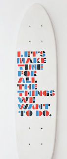
The concept of this book cover was to create something which could 'be non-absolute in terms of design and title, being non-committal to any fixed meaning and to any particular point in time.' This cover consists of a sticker book jacket with the letters saying 'I WANT THE TITLE OF THIS BOOK TO BE'; these letters are then peeled off, allowing the reader to create the "title" and design the final cover.


Top image:
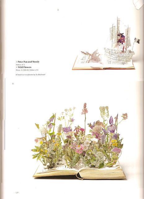
Peter Pan and Wendy

Bottom image:
Wild Flowers
Both by Su Blackwell

Su Blackwell brings a whole new meaning to the concept of the 'pop-up book'. These 'book-cut sculptures' as she calls them are stunning, and to see them rising up from something such as a book makes them even more special. I feel a bit cheated that as a child I didn't have stories read to me with this kind of illustrative input, but at over £1,500 per book, I can understand why.


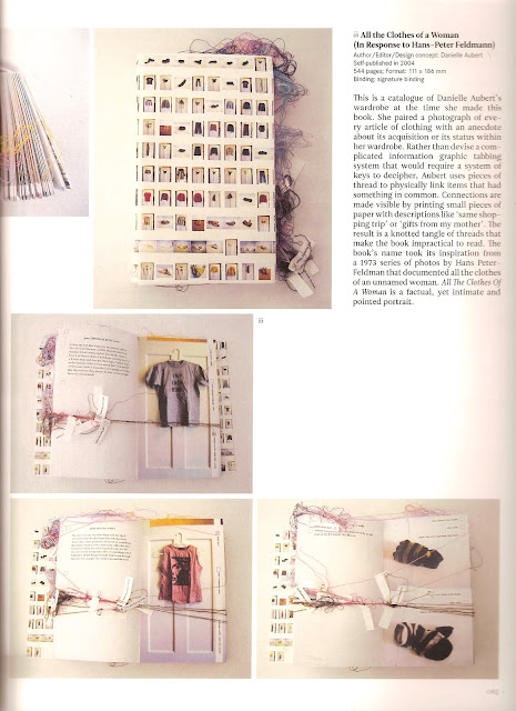
All the Clothes of a Woman (In Response to Hans-Peter Feldmann)
Danielle Aubert

This is a catalogue of Danielle's wardrobe; rather than creating a complicated 'key' or tabbing system, she uses pieces of thread to link items that have something in common. Aubert took photos of everything in her wardrobe, each of which had its own personal colour coded thread which could be joined with others, bunched together with little note wrapped around saying things such as, 'gifts from my mother' or 'same shopping trip'. This was a systematic way to scale down everything in her wardrobe to a more digestible size, if she liked a top, it would join to another thread which would take her to matching shoes, if she needed a reminder of what she bought on her last shopping trip, everything would be grouped together and easy to find. I thought this book was so clever and told such an interesting story of a womans wardrobe.


A series of handmade books
Erin Zamrzla

These covers are so inventive, using things such as cassettes, polystyrene, blackboards and egg trays; so simple but so different.


What a Load of Rubbish
Vaughan Ward

This book was created so that people could become more familiar with recycling. Each page has information on them, but to get to these, you are asked to rip off a covering piece of paper, which when you turn it over, reveals that instead, you could recycle it. The images show the amount of waste Ward recorded that left his house which accommodated six people over a period of three months, and alternating pages provide random recycling facts about things like cups of tea. Really loved that by making people interact with this book, the message it was trying to portray was put into action immediately.


S/S Advertising Campaigns

So as we are now well into the A/W advertising campaigns, I thought I'd take just a moment to share with you some of my favourite spreads from S/S '10.
I know that when your flicking through magazines you always have one or two campaigns which stick in your mind, but you may only realise this when you come across them again...if you don't feel like this then I'm sorry as this post may waste your time, but for those of you who are prone to ripping these beauties out and creating a mini shrine then I hope you approve of my choices below.
Would love to hear about, or see some of your most memorable campaigns...


Alena Akhmadullina - St Petersburg
The movement in this picture is stunning, the way the dress and body float even with such a distinct pose. The light and colours here illuminate, for me, a strong side to femininity.


Celine
I am in love with the tailoring of this brand and I think that the sophisticated simplicity which oozes from all their collections is reflected so well in this spread. Similarly to Marc Jacobs advertising campaign which included the faces of Vicotria Beckham and Vivienne Westwood representing his line using only one polaroid image, Celine seems to have taken this visual and adapted it to their brand, telling an honest story about how they only need to show the clothes, they don't need tricks and beautiful faces to emphasise them as the fresh cuts and clean lines do this all by themselves.


Hermes
The colours in this photograph are a perfect clashing mass of gorgeousness; of course everyone knows how high up a girls list a Hermes Scarf is, and the sense of luxury that screams at you from this photo is undeniable. I just think that this collision between the scarves' vibrant colours and patterns and the peacefull tranquility of everything else is glorious to look at.


Tom Ford
I'm sure you all know this one, personally I'd prefer Tom Ford himself as he is the most beautiful man that ever lived, but still, you cant fault his unique approach to sexy sophisitication....just wow.


Wrangler
I love the 'drama' in this spread; the excitment of the image alongside the bold statement create a sense of fierce power, labelling their clients as fearless and unstopable. I was really struck by how Wrangler told you how to look at them, how to categorise them and which mood you should be in or personality you should have to pick them. 


Wednesday, August 18, 2010

Tim Walker - 'The Lost Explorer'


 You may be more likely to recognise Tim Walker as the creator of Vogue shoots featuring white rabbits, Stately Homes covered in balloons or a tree covered in candy coloured cakes (as shown below), but for the past year he has been turning his unmistakably unique visions to film.  


He has been tipped off to be the next Tim Burton, offering a sinister edge to what would otherwise be innocent childish fantasies; but 'The Lost Explorer' will not be hitting the big screens, it is in fact entering the International Film Festival Circuit this year as a short film. 


In one of my internships this year, the company I was working for has been asked to advertise and market Walkers film, so I spent a great deal of time researching the short films that toured with the Festival this year (such as Cannes).
Below are the first images I have seen that show any indication of Walker's vision, and from only these few images, you can see what a visual masterpiece this is.


The story is about Evelyn, a young girl who finds an explorer living in a tent at the bottom of her garden, he is "dying of malaria and clutching a revolver" and he goes on to tell her stories of the "canary clouds" over the Atlantic. Walker says "it is a fairy tale with a gently shocking end" and a "lemon-curd-and-honey vision that just got darker".


He has brought this film together with the help of Robbie Ryan who worked on Andrea Arnold's 'Fish Tank' and Valerio Bonelli who worked on Ricky Gervais's 'Cemetry Junction'. This is going to be a piece of genius cinema and if your not lucky enough to see Mulberry's exclusive English Screening of the film at London Fashion Week, then your just going to have to wait until it hits the international circuit.