Wednesday, August 18, 2010

Tim Walker - 'The Lost Explorer'


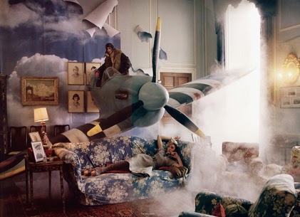
 You may be more likely to recognise Tim Walker as the creator of Vogue shoots featuring white rabbits, Stately Homes covered in balloons or a tree covered in candy coloured cakes (as shown below), but for the past year he has been turning his unmistakably unique visions to film.  


He has been tipped off to be the next Tim Burton, offering a sinister edge to what would otherwise be innocent childish fantasies; but 'The Lost Explorer' will not be hitting the big screens, it is in fact entering the International Film Festival Circuit this year as a short film. 


In one of my internships this year, the company I was working for has been asked to advertise and market Walkers film, so I spent a great deal of time researching the short films that toured with the Festival this year (such as Cannes).
Below are the first images I have seen that show any indication of Walker's vision, and from only these few images, you can see what a visual masterpiece this is.


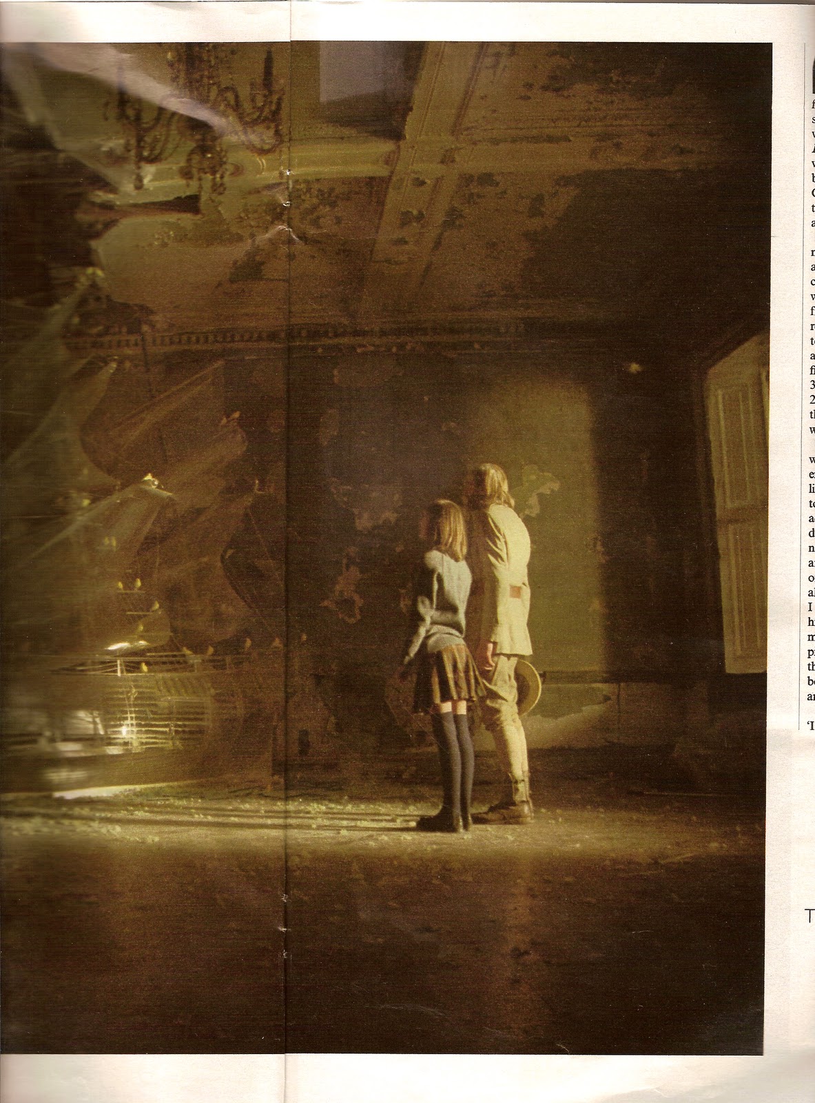
The story is about Evelyn, a young girl who finds an explorer living in a tent at the bottom of her garden, he is "dying of malaria and clutching a revolver" and he goes on to tell her stories of the "canary clouds" over the Atlantic. Walker says "it is a fairy tale with a gently shocking end" and a "lemon-curd-and-honey vision that just got darker".


He has brought this film together with the help of Robbie Ryan who worked on Andrea Arnold's 'Fish Tank' and Valerio Bonelli who worked on Ricky Gervais's 'Cemetry Junction'. This is going to be a piece of genius cinema and if your not lucky enough to see Mulberry's exclusive English Screening of the film at London Fashion Week, then your just going to have to wait until it hits the international circuit.


A/W 2010 - Roll on Winter Coats


So I know it's technically still Summer (even though I haven't seen it myself for a while) but I can't help getting excited about the new A/W collections appearing everywhere. With London Fashion Week hurtling towards us I wanted to just acknowledge the array of STUNNING coats all us ladies have to choose from this season. It's fair to say that the Burberry Prorsum Aviator Jacket is in a league of it's own, but what has really caught my eye is the come back of the women's classic camel coat. Aquascutum has relaunched the concept of sophistication with their tailored skirt suits and ankle length overcoats, whilst Stella McCartney has introduced a new take on the Boyfriend blazer, incorporating a new take on the dinner jacket collar and the mans over coat all rolled into one. I have been walking up and down Regent Street on my way to work, longingly staring into the shop windows owned by the designers of this season, however, a little more saving is required before I can bare to go and try something on without trying to shoplift it.

Craft Shop


I found this gorgeous craft shop in my Stella last weekend; unfortunately I live quite a way from Kent but I love the treasure trove of prints in here and I wanted to share this photograph for anyone else who gets excited about this kind of thing. This is somewhere I could easily spend a whole morning, looking for Birthday cards, thoughtful little gifts, or even using their craft shop to create a bunch of personalised Christmas cards... tragic....I know; but if anyone following this lives in Kent and knows of this beautiful little shop and has been lucky enough to spend some time in here, I'd love to hear about it.

Tuesday, August 17, 2010

Trick cards

No matter how old you are, you can never resist solving a few mind puzzles, especially when they look like this.


I've been rummaging around in my house for games I had when I was younger and came across a pack of playing cards with questions and images on, each of which set out to challenge and trick your mind. I've picked just a few as I thought putting all 52 up was a bit excessive.


I love the amount of ideas and inspiration you can draw from these cards; the graphics, the questions, the concepts. I still enjoy mind puzzles, although these are for children it's something that I think, no matter how old you are, you always want to be able to solve. 


The kind of puzzles we see now each day are ones such as sudoku, crosswords, spot the difference etc and unfortunately we do not see them like this regularly anymore which, when I look at these, makes me think it's such a shame. The graphics and tricks behind each card are so original and are so pleasing whatever age you are....you can't help but get a bit competitive....even if you may be trying to work them all out with a 6 year old (my poor little cousin). 


So glad I found these, think they're so much fun and really hope things like this don't go extinct!


Monday, August 2, 2010

London Transport Museum - Underground posters from 20th Century


So I've become a bit obsessed with early and mid 20th Century graphic design due to the below post and have found these posters at the London Transport Museum. I personally would much rather have these in our tube stations.

Magazine cover art - L'Officiel de la Mode


L'officiel de la Mode is the oldest running women's magazine in France, it has been in circulation for 80 years and has over 500 000 readers in France alone. This magazine's purpose is to discover "the French spirit of elegance" which 80 years ago would have been by looking at the talent of sewing; however the new modern day approach looks at new places, expositions, fashion, art, design and architecture. L'officiel pride themselves on knowing that their readers are of the upper classes and are the most fashionable and cultivated women of the big cities. 
The archives of their magazine covers have been released on the internet and I found myself scrolling through and stumbling across this sort of abstract style which was the face of this magazine  from 1920-1960. I love the colours that are used together and the way 'L'officiel' falls across the page, similarly to Vogue, it had made its mark in the Fashion world and so you didn't even need to be able to see the the full name or in some cases see it at all. I wanted to express how most of these early covers seem on the verge of chaos, but instead due to the genius of angles, colours and images all systematically grouped together, it becomes organised and beautiful.
The two covers simply with a portrait on and plain backgrounds for me show the effortless sophistication and style that France owned through the mid 20th Century, and still do to this day.
What I am drawn to is the impact of these images in such an early stage of graphic design; I find myself more fascinated by the graphics and their elegance in this era than the magazines now minimalist 21st Century approach which you can see in the archives. 


Brand Identity - Construct London


This is issue 3 of the Maybourne Papers, a magazine which was launched by The Maybourne Hotel Group to discuss it's three luxury hotels, The Connaught, Claridge's and The Berkeley.

I think the layout of this magazine is stunning and reflects exactly the luxurious brand of the hotels and it's elite clientele. The use of black and white and the strict typeface and block layout in the middle two images, as well as the curvy and more feminine arrangement in the top image are both a work or art. Another reason for my love of how this magazine's layout has been masterminded are the page inserts shown in these middle two images, they create an opportunity to introduce another concept into what could have been a single word or single image, they add layers and express a modern and quirky approach to your 'average magazine'. I think this is overall such a clever approach to what could have easily been a simple glossy magazine boasting about it's empire, but instead it's created it's own league of luxury magazine, even down to the paper used and the embossed gold foil on the front and back pages, it screams genius the whole way through!


Construct have also been asked to re-brand The Maybourne Hotels; this is an example of some of the already released designs for Claridge's. This black and white chevron pattern and bespoke green is what they have decided on to now be the face of this famous hotel, and the reason I wanted to show this is because this pattern was taken from the chevron floor of the foyer itself; I thought this was so interesting that when given this project, they didn't completely disjoint and separate the name from the building itself but actually decided to look to it to find a suitable way of representing this famous property worldwide, and I feel there is no better way to do that than introducing a modern take on Calridge's iconic floor.