

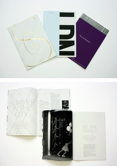
This is issue 3 of the Maybourne Papers, a magazine which was launched by The Maybourne Hotel Group to discuss it's three luxury hotels, The Connaught, Claridge's and The Berkeley.
I think the layout of this magazine is stunning and reflects exactly the luxurious brand of the hotels and it's elite clientele. The use of black and white and the strict typeface and block layout in the middle two images, as well as the curvy and more feminine arrangement in the top image are both a work or art. Another reason for my love of how this magazine's layout has been masterminded are the page inserts shown in these middle two images, they create an opportunity to introduce another concept into what could have been a single word or single image, they add layers and express a modern and quirky approach to your 'average magazine'. I think this is overall such a clever approach to what could have easily been a simple glossy magazine boasting about it's empire, but instead it's created it's own league of luxury magazine, even down to the paper used and the embossed gold foil on the front and back pages, it screams genius the whole way through!


Construct have also been asked to re-brand The Maybourne Hotels; this is an example of some of the already released designs for Claridge's. This black and white chevron pattern and bespoke green is what they have decided on to now be the face of this famous hotel, and the reason I wanted to show this is because this pattern was taken from the chevron floor of the foyer itself; I thought this was so interesting that when given this project, they didn't completely disjoint and separate the name from the building itself but actually decided to look to it to find a suitable way of representing this famous property worldwide, and I feel there is no better way to do that than introducing a modern take on Calridge's iconic floor.
No comments:
Post a Comment