I've just bought a book called 'Fully Booked', it's filled with hundreds of images of 'cover art and design' and I'm a bit obsessed with it. There are so many interesting concepts and ideas throughout it so I've picked a few to put up on here as I truly think this is the most inspirational book I own and I want to see if you think the same.
I Want the Title of This Book to Be
Design concept by H55
The concept of this book cover was to create something which could 'be non-absolute in terms of design and title, being non-committal to any fixed meaning and to any particular point in time.' This cover consists of a sticker book jacket with the letters saying 'I WANT THE TITLE OF THIS BOOK TO BE'; these letters are then peeled off, allowing the reader to create the "title" and design the final cover.
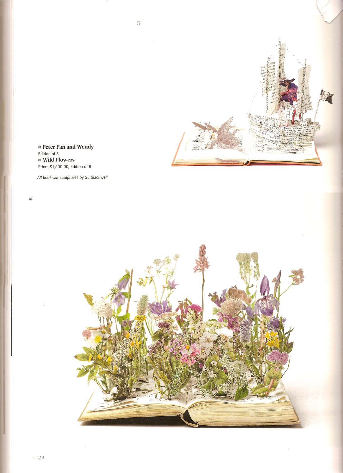
Top image:
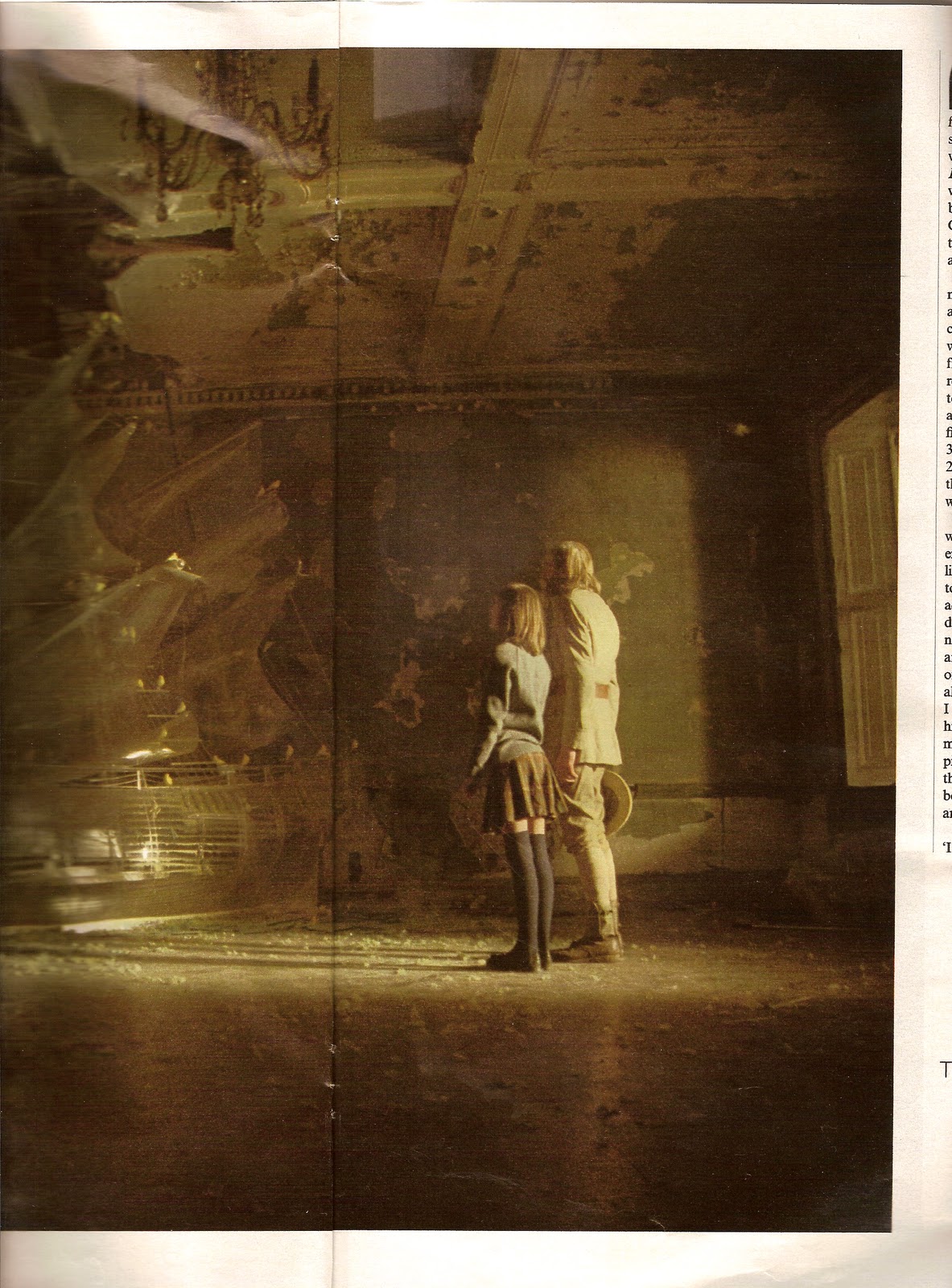
Peter Pan and Wendy
Bottom image:
Wild Flowers
Both by Su Blackwell
Su Blackwell brings a whole new meaning to the concept of the 'pop-up book'. These 'book-cut sculptures' as she calls them are stunning, and to see them rising up from something such as a book makes them even more special. I feel a bit cheated that as a child I didn't have stories read to me with this kind of illustrative input, but at over £1,500 per book, I can understand why.
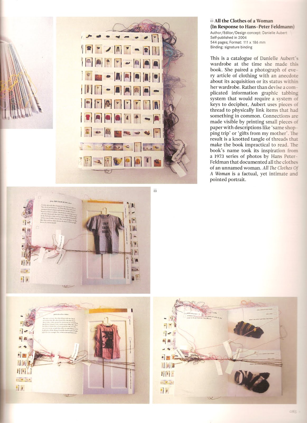
All the Clothes of a Woman (In Response to Hans-Peter Feldmann)
Danielle Aubert
This is a catalogue of Danielle's wardrobe; rather than creating a complicated 'key' or tabbing system, she uses pieces of thread to link items that have something in common. Aubert took photos of everything in her wardrobe, each of which had its own personal colour coded thread which could be joined with others, bunched together with little note wrapped around saying things such as, 'gifts from my mother' or 'same shopping trip'. This was a systematic way to scale down everything in her wardrobe to a more digestible size, if she liked a top, it would join to another thread which would take her to matching shoes, if she needed a reminder of what she bought on her last shopping trip, everything would be grouped together and easy to find. I thought this book was so clever and told such an interesting story of a womans wardrobe.
A series of handmade books
Erin Zamrzla
These covers are so inventive, using things such as cassettes, polystyrene, blackboards and egg trays; so simple but so different.
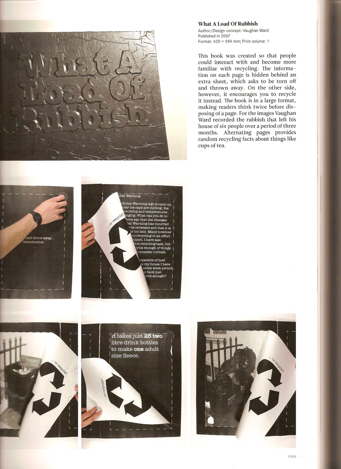
What a Load of Rubbish
Vaughan Ward
This book was created so that people could become more familiar with recycling. Each page has information on them, but to get to these, you are asked to rip off a covering piece of paper, which when you turn it over, reveals that instead, you could recycle it. The images show the amount of waste Ward recorded that left his house which accommodated six people over a period of three months, and alternating pages provide random recycling facts about things like cups of tea. Really loved that by making people interact with this book, the message it was trying to portray was put into action immediately.